Components
A React application's UI is constructed by a lot of components due to project scale. To save time and efforts of creating and managing components, we use a methodology called "atomic design".
Reference: https://bradfrost.com/blog/post/atomic-web-design/
Why atomic design?
In a lot of ways, this is how we've been doing things all along, even if we haven't been consciously thinking about it in this specific way.
Atomic design provides a clear methodology for crafting design systems. Clients and team members are able to better appreciate the concept of design systems by actually seeing the steps laid out in front of them.
Atomic design gives us the ability to traverse from abstract to concrete. Because of this, we can create systems that promote consistency and scalability while simultaneously showing things in their final context. And by assembling rather than deconstructing, we're crafting a system right out of the gate instead of cherry picking patterns after the fact.
What is atomic design?
Atomic design is methodology for creating design systems. There are five distinct levels in atomic design:
- Atom
- Molecule
- Organism
- Template
- Page / Screen
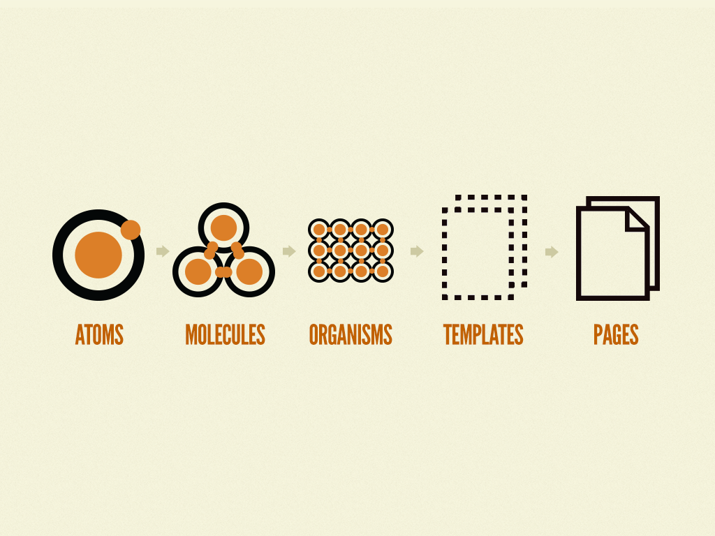
Atom
Atoms are the basic building blocks of matter. Applied to web interfaces, atoms are our HTML tags, such as a form label, an input or a button.
Atoms can also include more abstract elements like color palettes, fonts and even more invisible aspects of an interface like animations.
Like atoms in nature they're fairly abstract and often not terribly useful on their own. However, they're good as a reference in the context of a pattern library as you can see all your global styles laid out at a glance.

Molecule
Things start getting more interesting and tangible when we start combining atoms together. Molecules are groups of atoms bonded together and are the smallest fundamental units of a compound. These molecules take on their own properties and serve as the backbone of our design systems.
For example, a form label, input or button aren't too useful by themselves, but combine them together as a form and now they can actually do something together.
Building up to molecules from atoms encourages a "do one thing and do it well" mentality. While molecules can be complex, as a rule of thumb they are relatively simple combinations of atoms built for reuse.
Organism
Molecules give us some building blocks to work with, and we can now combine them together to form organisms. Organisms are groups of molecules joined together to form a relatively complex, distinct section of an interface.
We're starting to get increasingly concrete. A client might not be terribly interested in the molecules of a design system, but with organisms we can see the final interface beginning to take shape. Dan Mall (who I'm working with on several projects) uses element collages, which articulate ideas for a few key organisms to facilitate client conversations and shape the visual direction (all without having to construct full comps).
Organisms can consist of similar and/or different molecule types. For example, a masthead organism might consist of diverse components like a logo, primary navigation, search form, and list of social media channels. But a "product grid" organism might consist of the same molecule (possibly containing a product image, product title and price) repeated over and over again.
Building up from molecules to organisms encourages creating standalone, portable, reusable components.

Template
At the template stage, we break our chemistry analogy to get into language that makes more sense to our clients and our final output. Templates consist mostly of groups of organisms stitched together to form pages. It's here where we start to see the design coming together and start seeing things like layout in action.
Templates are very concrete and provide context to all these relatively abstract molecules and organisms. Templates are also where clients start seeing the final design in place. In my experience working with this methodology, templates begin their life as HTML wireframes, but over time increase fidelity to ultimately become the final deliverable. Bearded Studio in Pittsburgh follow a similar process, where designs start grayscale and layout-less but slowly increase fidelity until the final design is in place.

Page / Screen
Page is also called "screen" in mobile apps.
Pages are specific instances of templates. Here, placeholder content is replaced with real representative content to give an accurate depiction of what a user will ultimately see.
Pages are the highest level of fidelity and because they're the most tangible, it's typically where most people in the process spend most of their time and what most reviews revolve around.
The page stage is essential as it's where we test the effectiveness of the design system. Viewing everything in context allows us to loop back to modify our molecules, organisms, and templates to better address the real context of the design.
Pages are also the place to test variations in templates. For example, you might want to articulate what a headline containing 40 characters looks like, but also demonstrate what 340 characters looks like. What does it look like when a user has one item in their shopping cart versus 10 items with a discount code applied? Again, these specific instances influence how we loop back through and construct our system.
